How 2Blossom became Health Engineers
CLARITY WORKSHOPS + DESIGN CASE
A strategic rebrand that helped Amsterdam’s business 2Blossom clarify its services, define its core values, and evolve into Health Engineers. A complete transformation: bringing clarity and structure to the offer first, then translating it into a brand and website that reflect where the business is today.
Bring clarity first, then reinvent
This project focused on helping a founder bring clarity to her services and positioning. Through a combination of brand strategy workshops and design, we structured her offer, defined her core message, and translated it into a clear and distinctive website.
EXPERIENCES
Clarity for services
Positioning & differentiation
Brand aligned with values
A website that communicates clearly
Strategic thinking
Structuring complexity
Understanding client
Translating insight into design
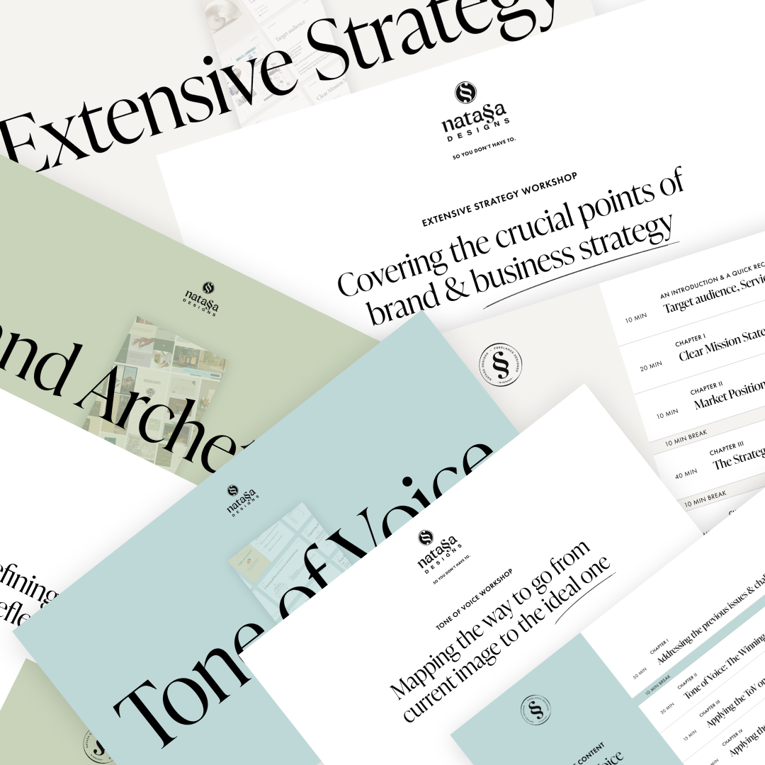
SERVICES USED FOR THIS PROJECT
Clarity workshops
Brand design
Web design
Structure & Positioning
Personality & Visual Direction
Voice & Messaging
3 different moodboards
Brand design & guidelines
Canva material
Desktop & Mobile pages
Figma
Developer-ready file
ABOUT OUR COLLABORATION
“Natasa helped me find my deepest purpose & drivers. She enhanced my services by providing clarity and structure with a beautiful website, distinguished from competitors.”
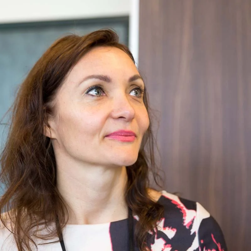
Laura Hoekstra
Founder of Health Engineers
Natasa helped me connect with the core of what drives my work and turn it into something clear and tangible.
When it all clicked, it was actually emotional for me. I realised this was exactly what I wanted to convey through my work. It gave me confidence in how I talk about my services and what my company stands for.
When we started working together, my services had grown over time, but lacked a clear definition. The previous website made the overall proposition feel incoherent to new customers.
Through Natasa’s workshops and strategy process, we structured my services, clarified my positioning, and identified the core values that drive my work. The archetype work was especially powerful: it resonated deeply with the core purpose behind my business and helped me articulate & communicate it more effectively to the right audience.
What stood out to me was Natasa’s ability to combine strategy and creativity. She didn’t just design a website; she helped me translate what I stand for through my company into something clear, professional, and distinctive.
The result is a brand and website that finally reflects my work, speaks to the right clients, and feels authentic. I also gained confidence in how I talk about my services and how I position myself in the market.
“Before working together, my services lacked cohesion. Now everything is structured and easy to explain. The process was creative, inspiring, and energising; not heavy or intimidating.”
Clarity workshops
Strategic brand foundations: positioning, archetypes, and a distinctive tone of voice
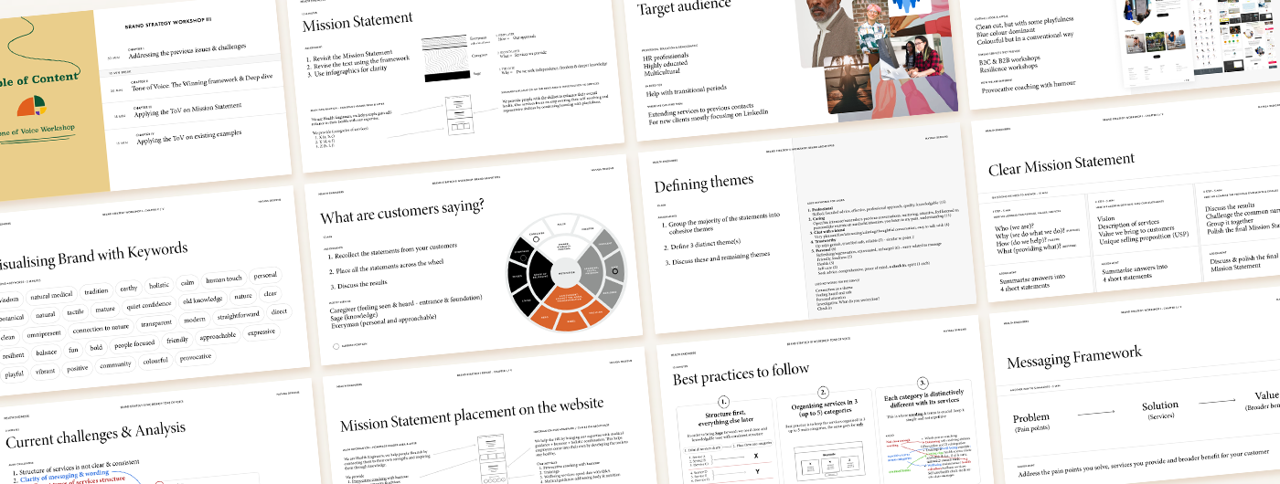
A deep-dive with Clarity Workshop
Three distinct workshops defined the brand’s foundations, which guided the visual identity and the structure of the website.
Workshops taken by client were:
Structure & Positioning
Personality & Visual Direction
Voice & Messaging
These insights directly influenced:
Art direction & moodboard
Brand & visual identity
Website design
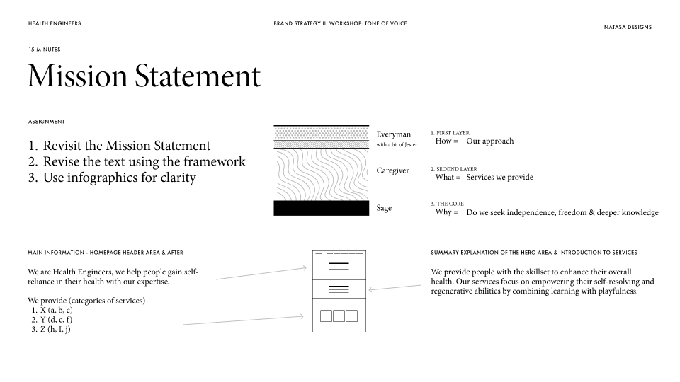
Forming, refining and placing the Mission Statement
Structure & Positioning:
Defining the Mission statement and services clearly and simply.Personality & Visual Direction:
We identified a personalized combination of Brand archetypes by answering the key questions: Who, How, What, and Why.Voice & Messaging:
Refining the Mission Statement with the unique formula we got from the Brand Archetypes workshop, and placing it on the Homepage.
Going beyond the industry standard to provide the right Brand choice
In design industry, we usually approach the brief with a certain process which results in a maximum of 2 different solutions. That is the common advice. Do not provide too many choices. Normally, I tend to agree. But what if there is an exception? This was the case with Health Engineers.
We have accomplished our workshops, and at that time, I wasn’t assigned to do Brand design. But still, it felt like a logical next step. So, on my own, I ended up proposing 3 distinct directions, each targeting the keywords we extracted as defining the brand. Those were:
- The Antique: esoteric knowledge
- The Natureal: the connection to nature
- The Humanist: people
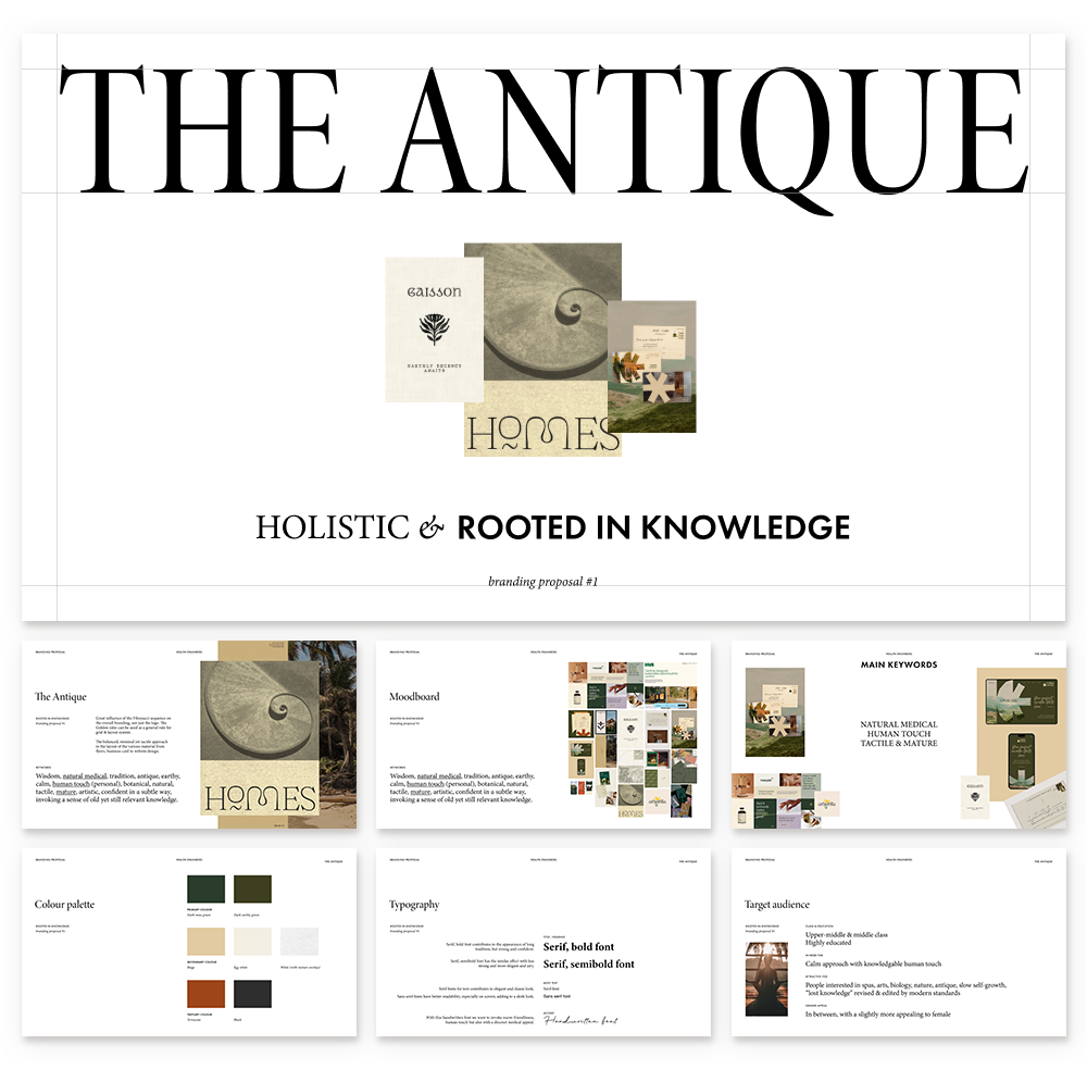
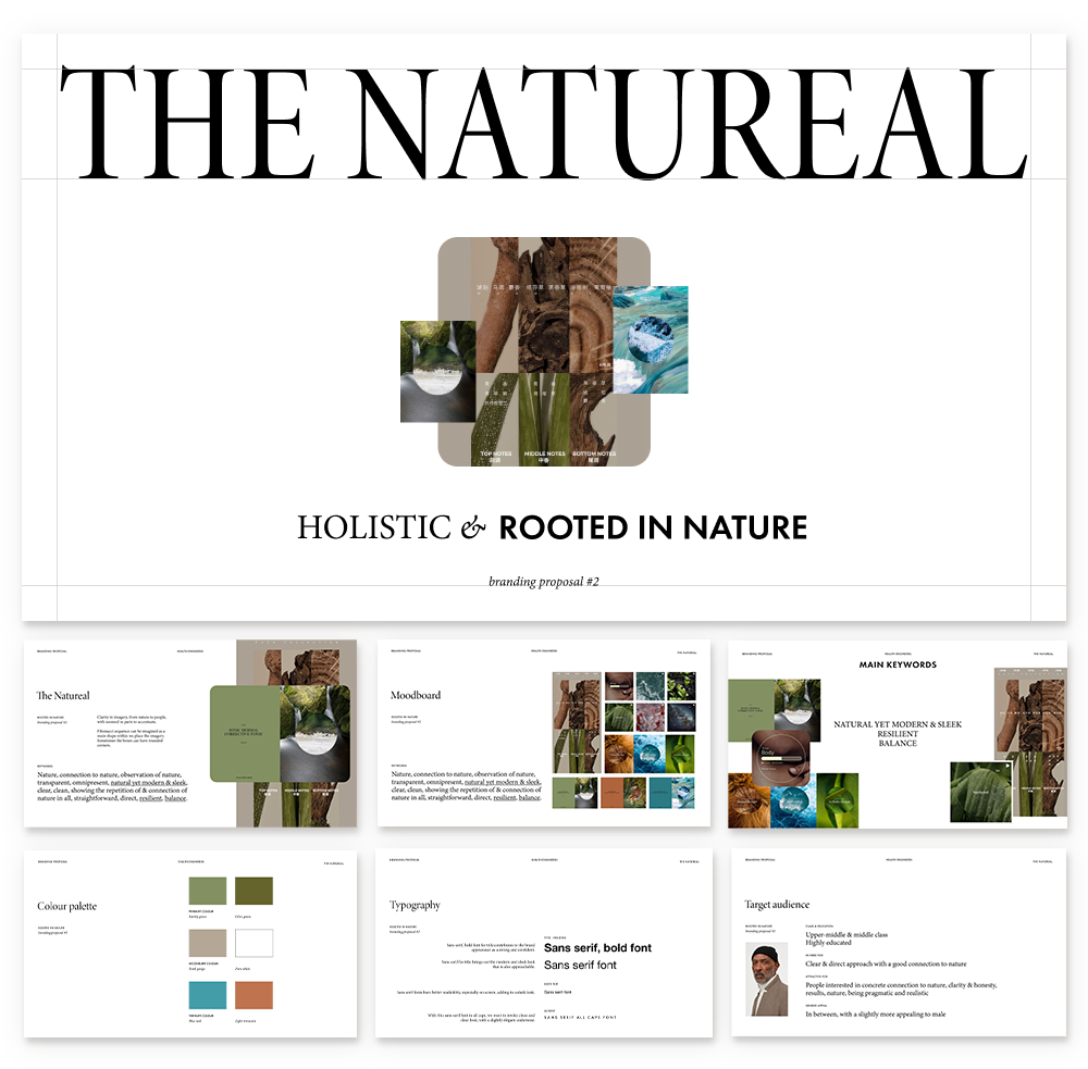
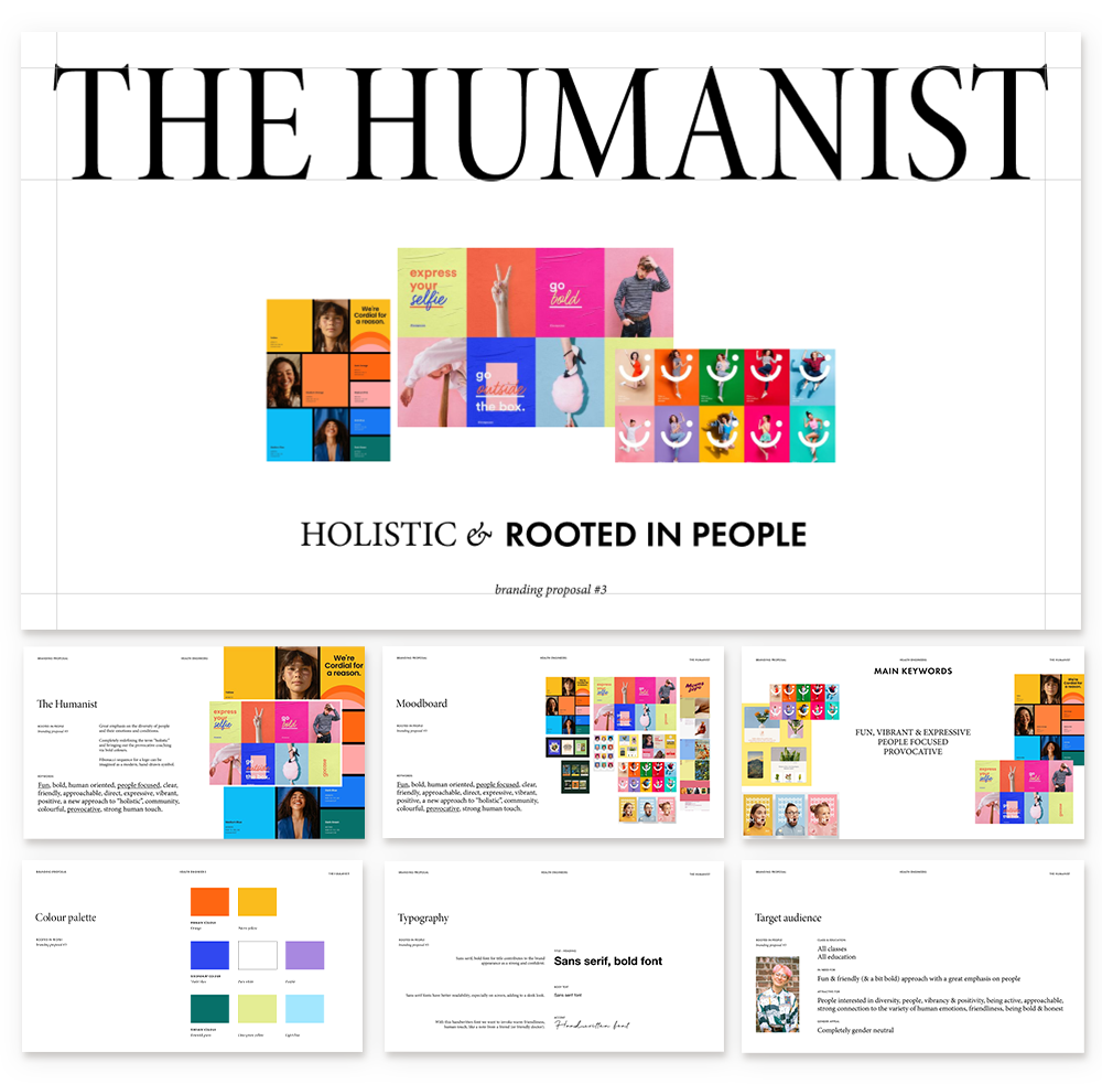
HAPPY OUTCOME: The client loved the extra effort and elaborate explorations, chose The Humanist, and we extended our collaboration to Brand design as well.
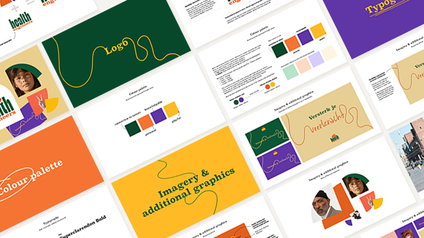
Brand design
Translating our brand strategy into a distinctive visual identity that stands out and stays consistent
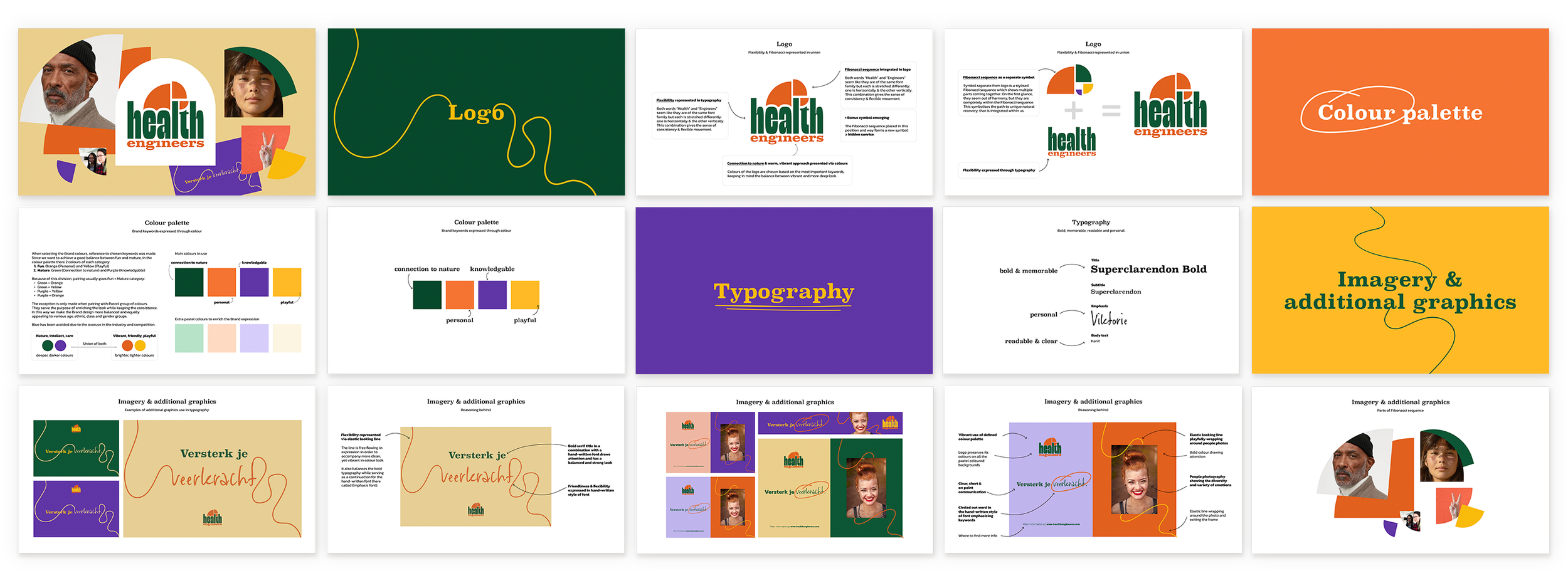
A visual identity completely rooted in the brand strategy
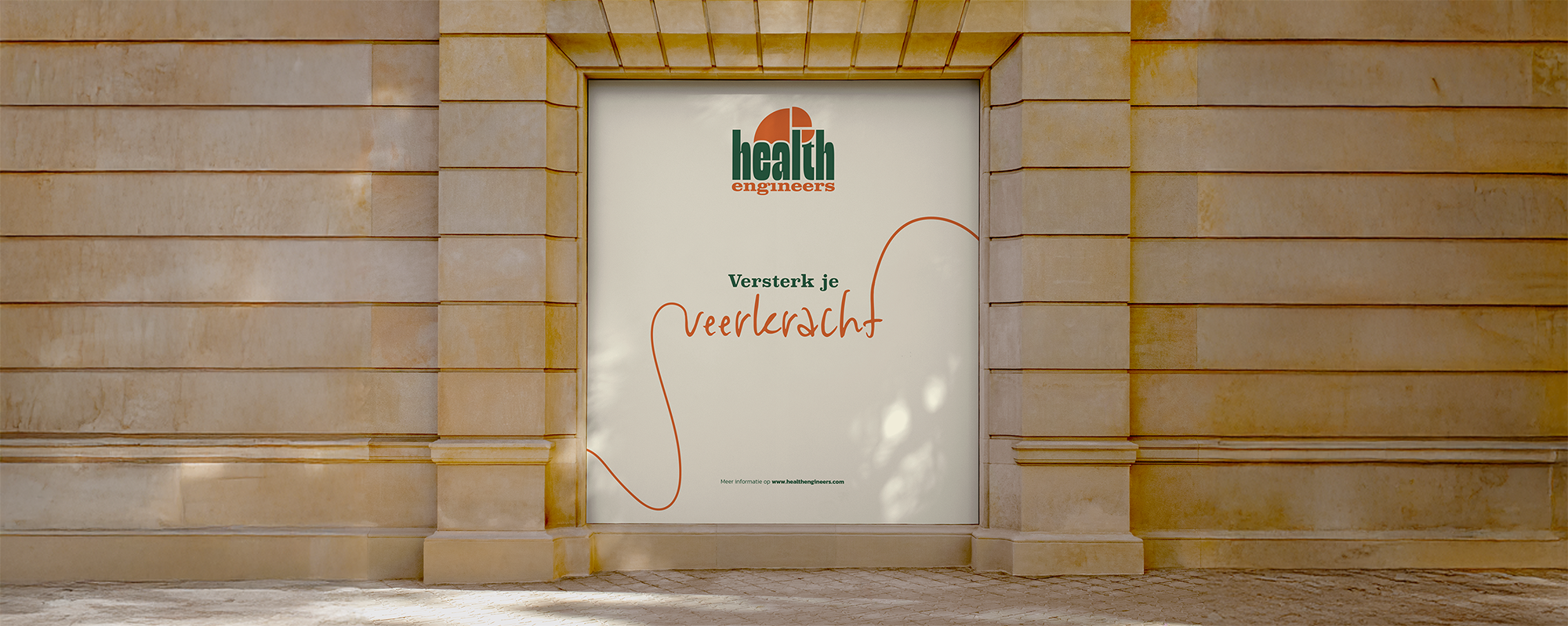
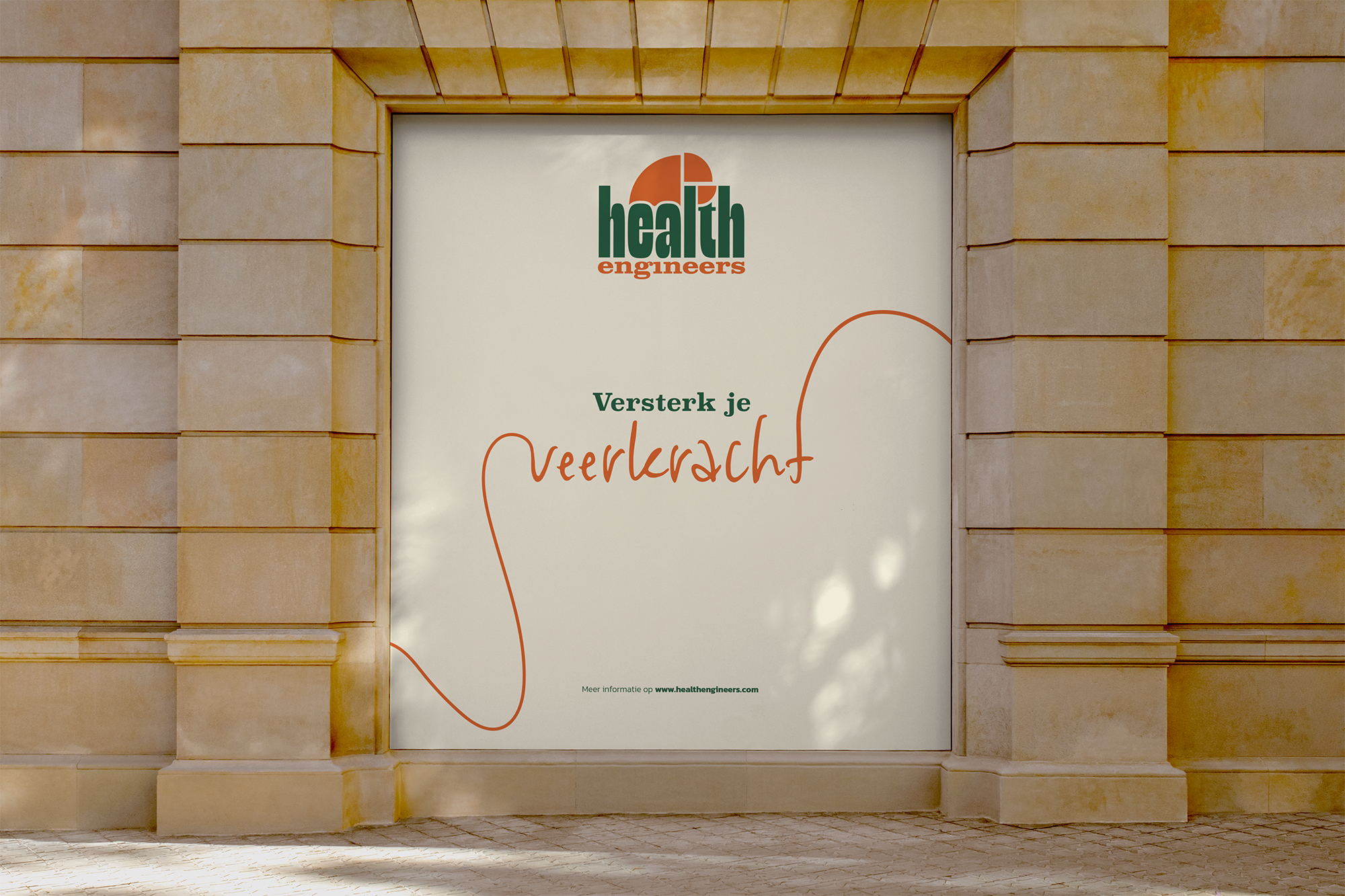
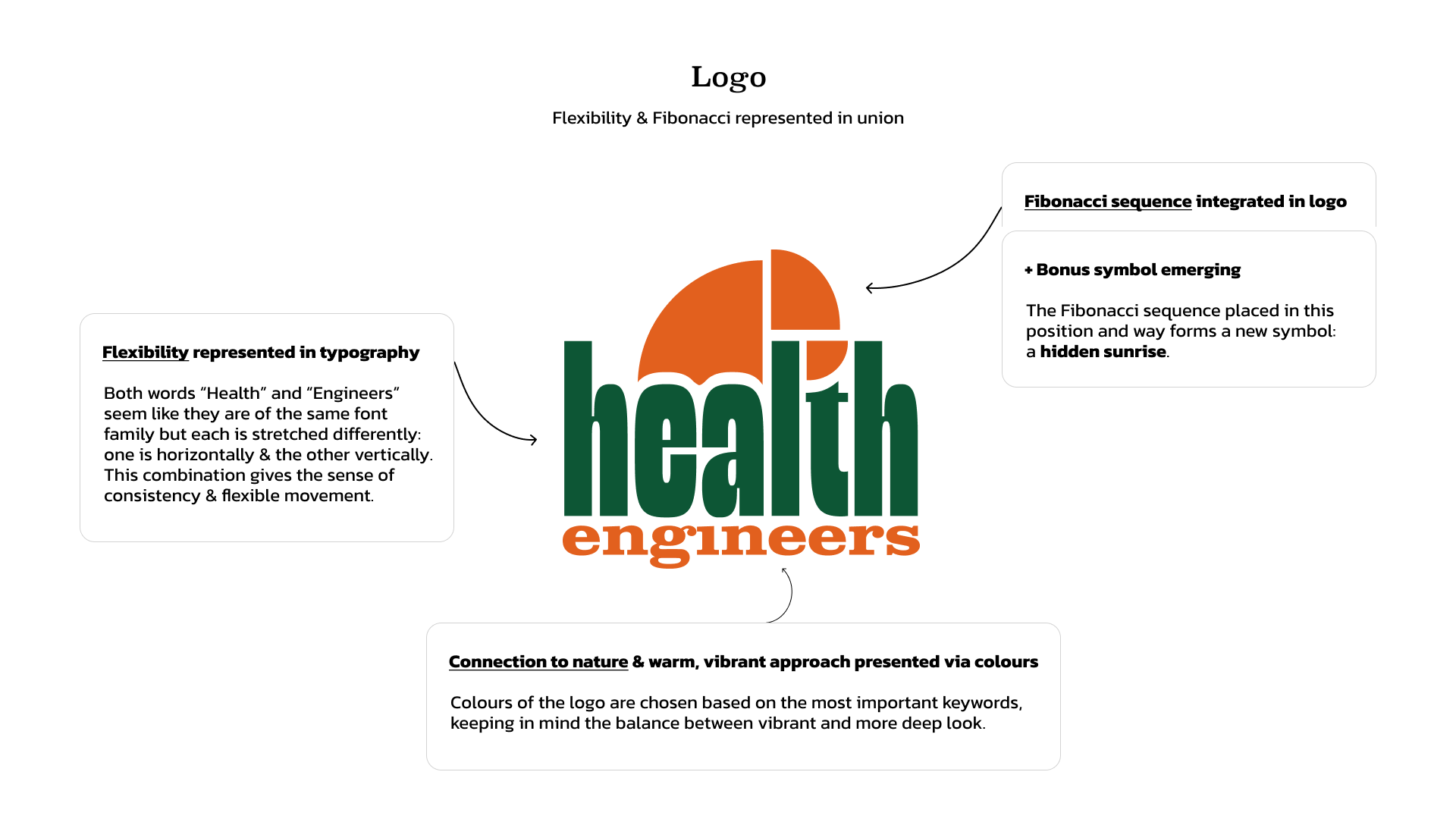
We started with Fibonacci sequence as a main guide my client wanted to use. The Fibonacci symbol embodies the wonder, power, and inherent logic of nature, of which we humans are a part.
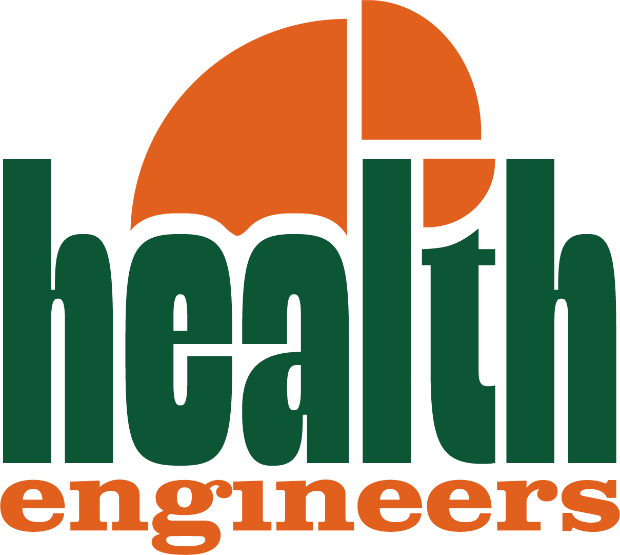
Logo design
Color palette & typography
Visual style & brand elements
Brand guidelines
Canva extra material
After our Strategy workshops, I saw the need to embed it discreetly into a more friendly font, which combination has an illusion of stretch, pull, and movement. This was important to express, to symbolise the resilience that my client’s services focus on.
Brand guidelines
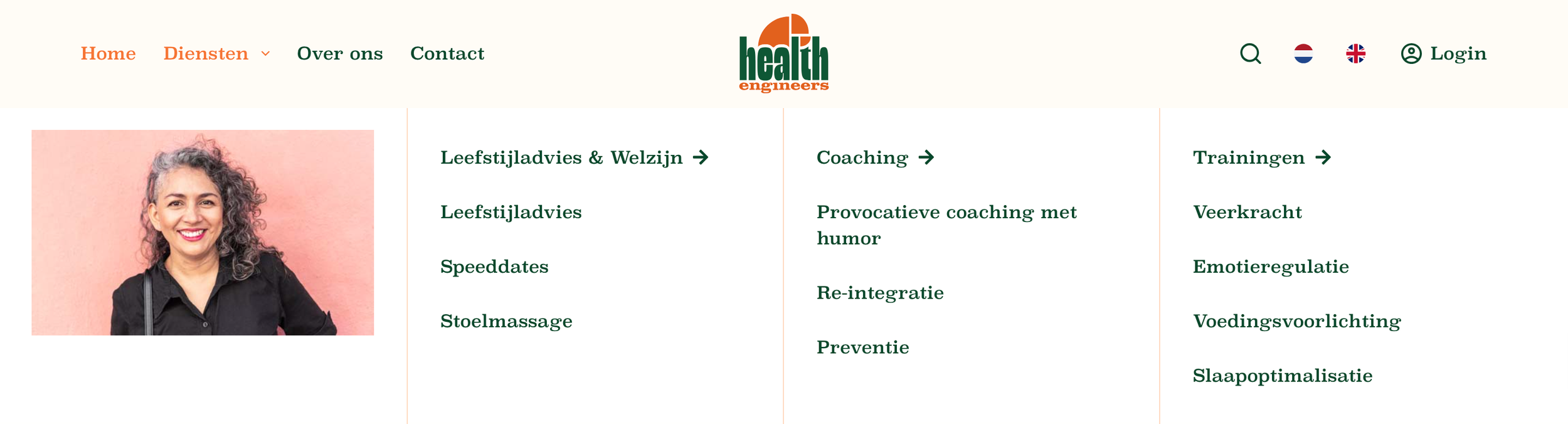
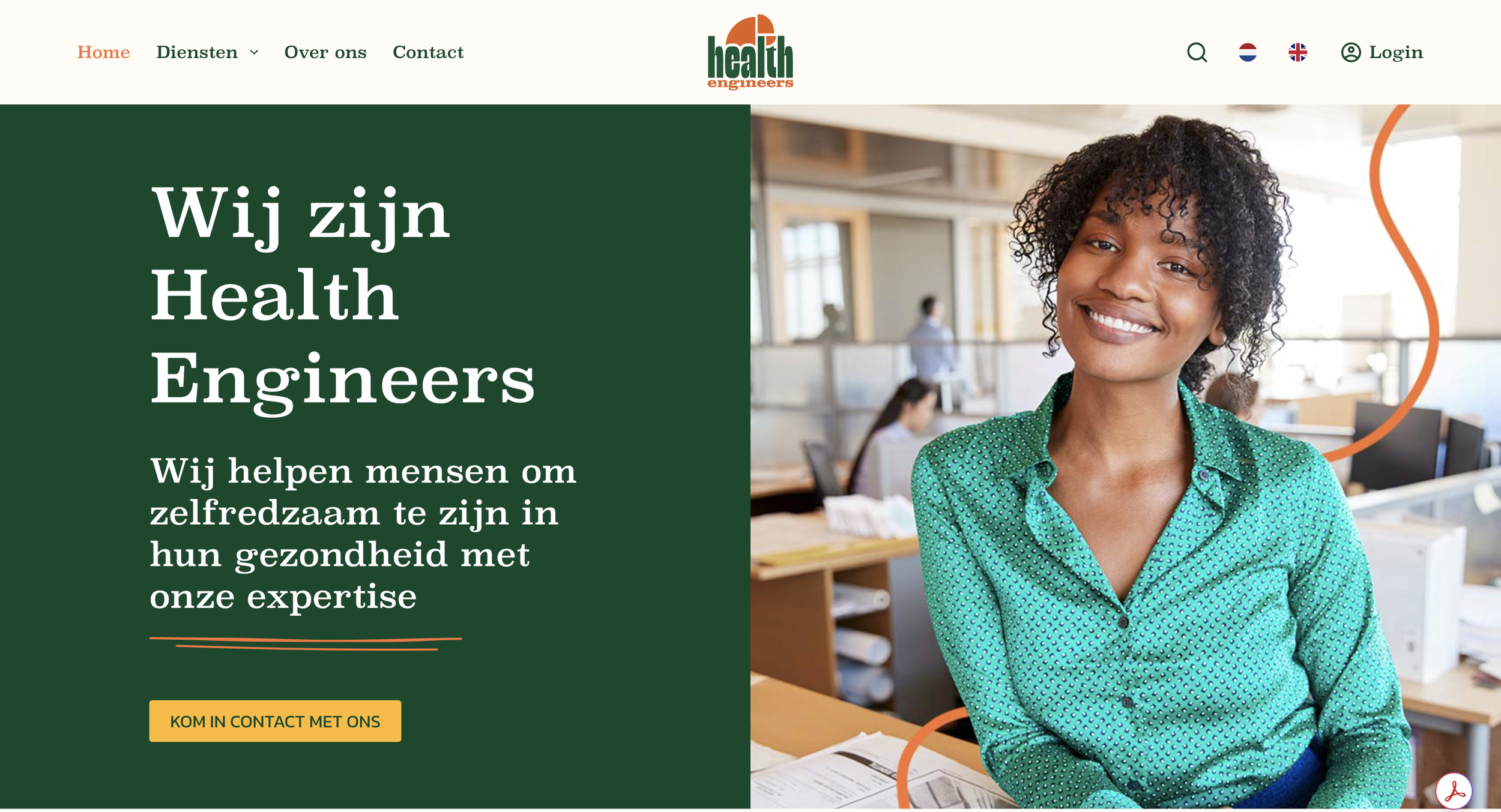
Web design
From brand strategy & visual identity to a structured website experience
A website lacking cohesion, obscuring how services fit together
Client’s customers reported they struggling to see how the services fitted together, which gave us a good start for the complete redesign. I focused on the clearly structured website first, then made sure the newly established visual style was applied.
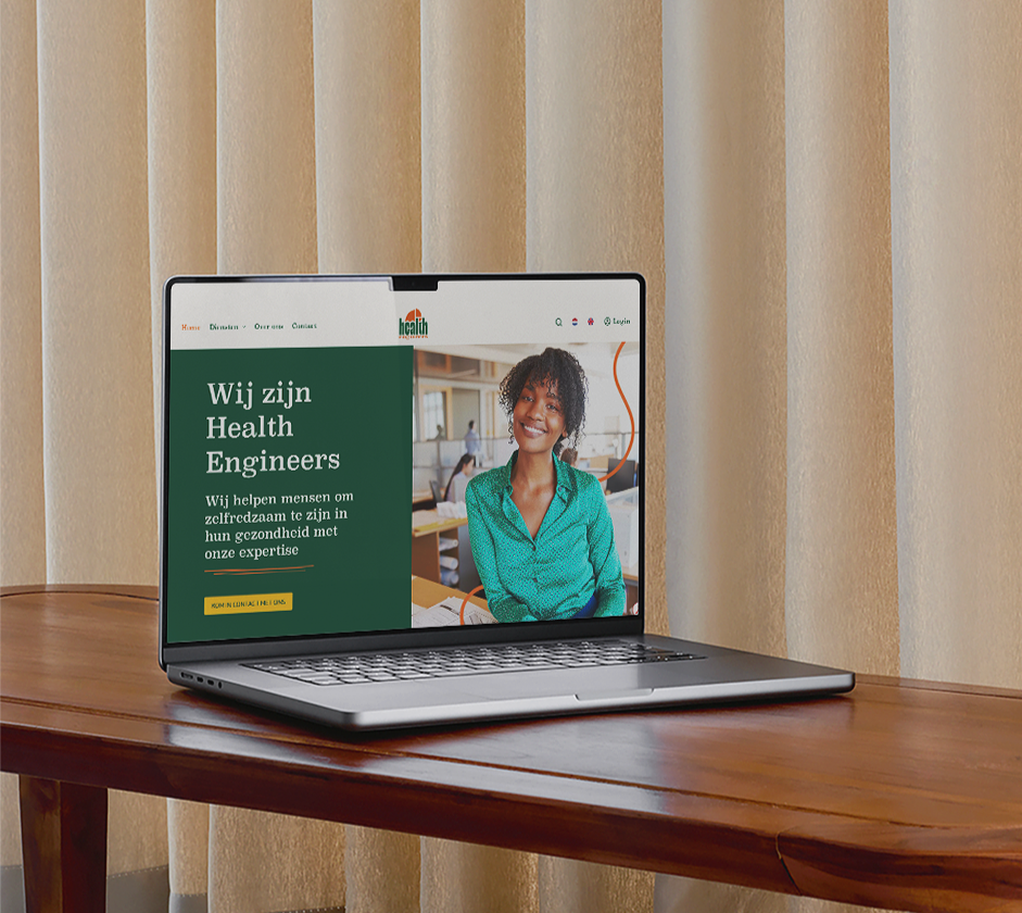
The new website navigation & experience are reported to be clear, enjoyable, and trustworthy